Tips for Power App Design and Support
- Kyle Anderson

- Sep 25, 2020
- 6 min read
Power Apps is an exciting, everchanging land scape that produces some interesting challenges.
There are many ways to develop a Power App, but there are some things that you can do to make your apps more user friendly and easy to maintain. In this post we'll cover a few of the things I have learnt in my Power Apps journey that have made my life easier.
Our Tips
Permissions Based on Group Membership
User Experience Based on Group Membership
Maintenance Screen and Developer Mode
Dynamic Option Sets Using a Collection and Gallery
Dynamic Galleries
1. Permissions Based on Group Membership
Our first tip is very simple but could save you a lot of time and effort if you have a high turnover of app users, or your system integrates a number of different resources and platforms.
When setting up your system, you very often need to apply permissions to multiple areas such as Power Apps and SharePoint sites, but using a group can allow you to give your users access to all these resources by managing one item. The group can be in the form of a security or 365 group - in this example I am using a security group called "App Users".
We simply share our Power App and SharePoint site with the group, and when a new user needs access, we add them to the group meaning instant access to all necessary resources.


Quick and effective.
2. User Experience Based on Group Membership
Sticking with the group membership theme, one of the things that I have started doing is using group membership to shape the user experience of my apps by displaying controls that are otherwise hidden.
In this example we use an admin/developer security group that can access a settings option in our app. This new icon allows our developers to move to a developer screen that can take the app out of commission while issues or updates are being fixed and implemented.
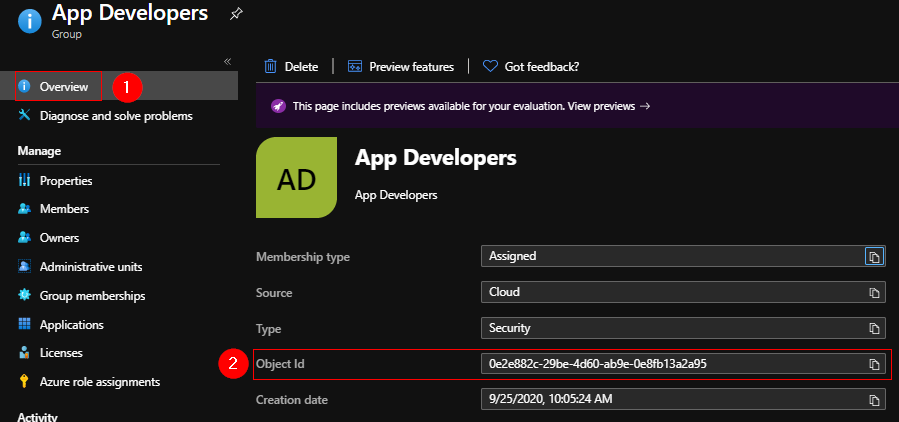
First, we will need a 365 group or security group ID. This can be found either in Azure AD (if you have access) or by adding the group to a SharePoint site and looking at its claims.


Once we have the ID, we can open our Power App in the editor and add the "Office365Groups" and the "Office365Users" connectors. Then follow these simple steps.

In the "OnStart" property of the app add the below formula - this will check if our current user is a member of our group:
If(
    Office365Users.MyProfileV2().id in Office365Groups.ListGroupMembers("<GROUP ID>").value.id,
    Set(
        varIsAdmin,
        true
    ),
    Set(
        varIsAdmin,
        false
    )
)
Now add your control - in this case an icon, and change the visibility property to "varIsAdmin". We can add the logic test to the icon directly, but there is a delay in which the icon is visible on the home page to non-members while the app is loading. Doing it this way hides the icon from the beginning, and only shows the icon if the user is a member of our group.

3. Maintenance Screen and Developer Mode
Now that we have a way of controlling access to a control or set of controls, we can use this to activate a developer/maintenance mode. By assigning our hidden icon the function of navigating to a new screen, we can use this screen to update aspects of the app without needing to open it in the editor and publish new versions. One thing I have been grateful for in my apps is a screen informing users that the app is down for maintenance - especially with hundreds of users and a slight bug in the workflow.
First, we'll need somewhere to store our setting - this will need to be readable by your app users. For this example, I will use a simple SharePoint list item with broken permissions to store whether "DevMode" is on or off.

Navigate to the "List Permissions" settings and select "Stop Inheriting Permissions" - this will sever the permissions that sync down the SharePoint site and let you create a new permissions structure.


With our permissions broken we can delete our existing permissions and add our security group with read only permissions. Also make sure that the app developers have full control of this list.


Now that the permissions are setup, we can setup the "DevMode" in our app.
We'll start with a new screen called "Dev Screen" and a simple checkbox control - this will be linked to our SharePoint list item. Make sure that your new SharePoint list has been linked to your app as a data source.
In the "OnCheck" property add the following formula:
Patch(Maintenance,{ID: 1},{Value:"On"})In the "OnUncheck" property add the following formula:
Patch(Maintenance,{ID: 1},{Value:"Off"})

Testing this we will see the "DevMode" value in SharePoint changes appropriately when we check and uncheck the checkbox control.


Now that we know that this is working, we can add our final component, the "Maintenance Screen". On the home page of your app, add a simple white rectangle, a label and a button, we'll group these elements together and call them "Maintenance Screen". In the visibility property of the group, add the following formula - this will check the value of our maintenance list to see if it's "On" or "Off":
First(Filter(Maintenance,ID=1).Value).Value="On"
And finally, we'll set our button to navigate our user away from the app using one of the three formulas below:
Exit and navigate back to the list of apps
Exit()Exit and log user out of Power Apps
Exit(Logout)Launch another Power App or website in the same tab.
Launch("<YOUR URL>",{},LaunchTarget.Replace)This technique is fantastic if you have a large user base and need to fix a failing Flow in Power Automate, or update something in your backend, it stops the constant stream of traffic and allows you to update or fix issues without being bombarded with new data or failed requests.
4. Dynamic Option Sets Using a Collection and Gallery
One thing that is common across all the screens of your app is the need to navigate. This next tip will show you how to create a navigational collection to easily enhance the aesthetics of your navigation controls.
Once we have all the screens needed for our app, we need to create a collection to house information about them. We can collect the name, the screen, an icon to represent them, images, descriptions and whatever else you may need. My navigation menu is going to consist of three options in the first instance. To set this up, we'll navigate to the "OnStart" property of the app, and paste in the following formula - this will build a collection:
ClearCollect(
    colNav,
    {
        Id: 0,
        Name: "Home",
        Screen: Home,
        Icon: Icon.Home
    },
    {
        Id: 1,
        Name: "Applications",
        Screen: Applications,
        Icon: Icon.DetailList
    },
    {
        Id: 2,
        Name: "New Application",
        Screen: 'New Application',
        Icon: Icon.AddDocument
    }
)

Once the collection has been setup, we can add in a gallery control and setup our menu.
We'll use a horizontal gallery and add the collection "colNav" as our data source, resize the gallery as needed and add in an icon. In the "Icon" property of the icon control add in the below formula:
ThisItem.IconYou'll notice that the icon immediately changes to the icons we chose in our collection


We can also add in a label with the name of the item by using:
ThisItem.Name
And finally, we can setup the actual functionality of the navigation control. Once again we take advantage of the screen that we added to the collection by adding the following formula in the "OnSelect" property of our gallery:
Navigate(ThisItem.Screen)
With that our navigational item is complete. You can expand this to include as many screens as needed, you can also add this to a custom component that is being used throughout your app.
5. Dynamic Galleries
Now that our navigational collection has been setup, and you have sized your gallery to match the number of items in your collection, you get contacted by your client and told to add something new to the app that will require a new screen. Does that mean you have to go resize your navigation menu to match? Not if you sized the gallery dynamically. And to do this we simply need to understand what a gallery template is and some basic maths.
A template is the individual block that you are editing inside of when working with a gallery. It is where you add all your controls in the gallery, and it has its own properties too. In our example we are going to take advantage of the template width to size our gallery depending on how many items exist in our collection.
To do this, find the galleries "Width" property and add in the following formula - simple maths, number of items multiplied by the size of the template:
CountRows(colNav)*galNav.TemplateWidthOnce we have done that, you'll probably find the scroll bar has appeared in your gallery. This can be turned off, but you may want to give your items more space by removing the template padding.


And the last thing we are going to do for our home page navigation control is centre it on our app with the below formula, and change the template fill to show the selected item:
App.Width/2-Self.Width/2
"Template Fill" of the gallery, or the background colour of the icon could both be used in this exmple
If(ThisItem.IsSelected,ColorFade(Gray,70%), White)
Now when we add our fourth item to the navigation collection, the control will adjust as needed and our gallery has resized and recentred itself dynamically.

In Conclusion
There are many little tricks and tips that can be learnt, these are just some of the ones I found made my apps far better when I started implementing them. I'd be intrigued to know what other little tricks and tips are out there, feel free to share them, I'm always happy to take information that will make me a better developer.


Comments